Typography for Building Valuable Brands
Legibility and readability in practice
A course by Fabio Haag, Type Designer


About the video: Legibility and readability in practice
Overview
“Here, you will see in practice how we apply current scientific knowledge to typographic decisions in our daily lives.”
In this video lesson Fabio Haag addresses the topic: Legibility and readability in practice, which is part of the Domestika online course: Typography for Building Valuable Brands. Discover the power of typography in creating valuable and effective branding. Learn how to make informed typographic decisions..
Partial transcription of the video
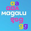
“Let's now explore some features that make typefaces more readable and user-friendly in practice. Open endings and wide counterforms. When the endings of letters are overly closed. individuals with minor visual impairments may mistake letter for another. such as confusing C. o. or A due to similarities. Ensuring these characters are Open endings help achieve this by expanding the internal space. The counterform. which is the negative within letters. highlights the distinct shape of each letter. making them more recognizable and easier to Secondly. steer clear of common impostors. But who exa...”
This transcript is automatically generated, so it may contain mistakes.
Course summary for: Typography for Building Valuable Brands
-
Category
Calligraphy & Typography -
Software
Adobe Illustrator -
Areas
Branding & Identity, Typography, Typography Design

Fabio Haag
A course by Fabio Haag
Fabio Haag is a highly accomplished type designer known for his expertise in corporate typography. With over 17 years of experience, he has crafted custom fonts for renowned brands around the world, such as Banco do Brasil, Globo, GOL, and Tramontina.
Fabio's unique approach to type design sets him apart, as he combines his creative vision with a deep understanding of business strategy. His focus on anchoring design decisions to the core principles of each client's brand allows him to create typography that adds significant value.
Having worked as a global creative director for one of the largest corporate typography studios, Fabio gained a holistic perspective on how typography can enhance brand communication. He brings a wealth of knowledge and practical insights to his teaching, empowering students to unlock the potential of typography in visual identities.
- 100% positive reviews (60)
- 2,080 students
- 19 lessons (2h 41m)
- 28 additional resources (14 files)
- Online and at your own pace
- Available on the app
- Audio: Portuguese, German, English, Spanish (Latam), French, Indonesian, Italian, Dutch, Polish, Romanian, Turkish
- Portuguese · Spanish · English · German · French · Italian · Polish · Dutch · Turkish · Romanian · Indonesian
- Level: Beginner
- Unlimited access forever
Recommended software & tools for this course
 Adobe Illustrator
Category
Areas

