Orthotypography for Designers
A course by Raquel Marín Álvarez, Graphic Designer, Illustrator, and Writer

Joined January 2015


Learn in great detail the typographical standards for the characters you design with
Joined January 2015

Raquel Marín (Lalolagráfica) is a graphic designer and expert in typography. It is specialized in orthotypography, that is, the set of rules that govern the correct use of typography.
In this Domestika course you will learn the correct application of the signs and symbols found on the keyboard and in the menus of the programs with which you design (quotes, dashes, stripes, brackets, voladitas, acronyms, italics, small caps ...)
Do not forget that a graphic designer, as a visual communicator, must constantly issue typography messages and it is vital to do it correctly.
What will you learn in this online course?
18 lessons & 18 downloads

What's included in this course?
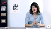
You will begin knowing more in depth the work and the influences of Raquel Marín.
Next, Raquel will explain what orthotypography is and where the responsibility of a graphic designer begins and ends in its correct application.
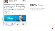
Then, through some examples, you will see the most common lack of orthotypography and perform some level tests to test your knowledge.
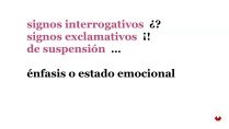
Next, Raquel will show you the differences between sign and symbol, examples of the different employment possibilities and how to make the most of her expressivity by defining her functions. Once we have analyzed all the signs we have in typography and how they are used correctly, we will go on to study what are the distinctive types and how their use helps us to emit clearer and more effective messages visually.
Finally, Raquel will give you 10 tips to solve common problems in the use and application of typography and be able to get through all of them.
- 98% positive reviews (252)
- 3,885 students
- 18 lessons (2h 53m)
- 18 additional resources (13 files)
- Online and at your own pace
- Available on the app
- Audio: Spanish
- Spanish · English · Portuguese
- Level: Beginner
- Unlimited access forever
Recommended software & tools for this course
 Adobe InDesign
What is this course's project?
You will design a typographic and informative poster with real texts and full-meaning sentences using InDesign. You must apply the rules seen during the course and get, not only do something beautiful, but a piece that transmits relevant information.

Projects by course students


Who is this online course for?
Designers, publicists, journalists, copys and anyone who wants to learn how to apply typography well and get all the expressive potential of the sources he uses.
If you have ever wondered why we have all these types of quotes, how the acronyms are written, why they are abbreviations, how to write a foreignerism or if the figure is written or not to the percentages, this is your course.
Requirements and materials
No previous knowledge is needed, just want to learn to write correctly and know how to use in depth all the resources offered by the sources with which we work daily: quantities, signs, acronyms, magnitudes, foreign words, dates, symbols, percentages, quotes ...
Regarding the materials, you will need to have a computer with InDesign and fonts installed in it (even if they are from the system).

Reviews

Raquel Marín Álvarez
A course by Raquel Marín Álvarez
Raquel Marín Álvarez earned her first degree in humanities and graphic design. After completing her master's degree in advanced typography at the Autonomous University of Barcelona, she began working as a designer for different studios and publishers. In 2009, she decided to open her own studio, Lalolagráfica, where she designs books, magazines, and stationery materials. She also illustrates for The Bright Agency in London.
When she's not creating, she shares her knowledge of typography at art schools, master's programs, universities, foundations, and anywhere where there's an interest in writing well and sending clear, concise messages. She's the author of two books, Ortotipografía para diseñadores and Diccionario de trucos para pulir tus textos, and writes articles about typography and orthotypography for different outlets.
Content
-
U1
Introduction
-
Presentation
-
Influences
-
-
U2
Typography and orthotypography: convergences and divergences
-
Nobody's land
-
What is orthotype?
-
Graphic design and lack of orthotypography
-
Level test where do you come from?
-
-
U3
Signs as an image: first aid
-
Signs and symbols: expressive economy
-
Quotation marks: classes and uses
-
Apostrophes, bonuses and superscripts: conflicts
-
Horizontal signs: differences
-
Vertical signs: correct and incorrect uses
-
Spaces and whites in typography
-
-
U4
Voices in typography: distinctive types
-
Distinctive types: how and for what
-
Italic: when yes and when not
-
Quotation marks: typical errors
-
Capital letter: use and abuse
-
Versalita: that great unknown
-
-
U5
Ten tips on orthotypography for your project
-
Ten tips on orthotypography for your project
-
-
FP
Final project
-
Orthotypography for designers
-
What to expect from a Domestika course
-
Learn at your own pace
Enjoy learning from home without a set schedule and with an easy-to-follow method. You set your own pace.
-
Learn from the best professionals
Learn valuable methods and techniques explained by top experts in the creative sector.
-
Meet expert teachers
Each expert teaches what they do best, with clear guidelines, true passion, and professional insight in every lesson.
-
Certificates
PlusIf you're a Plus member, get a custom certificate signed by your teacher for every course. Share it on your portfolio, social media, or wherever you like.
-
Get front-row seats
Videos of the highest quality, so you don't miss a single detail. With unlimited access, you can watch them as many times as you need to perfect your technique.
-
Share knowledge and ideas
Ask questions, request feedback, or offer solutions. Share your learning experience with other students in the community who are as passionate about creativity as you are.
-
Connect with a global creative community
The community is home to millions of people from around the world who are curious and passionate about exploring and expressing their creativity.
-
Watch professionally produced courses
Domestika curates its teacher roster and produces every course in-house to ensure a high-quality online learning experience.
FAQs
Orthotypography is the set of rules that govern the correct use of signs and symbols in printed or digital texts. It’s essential in editorial design because it ensures clarity, readability, and professionalism in graphic messages.
The course is aimed at people with basic knowledge of graphic or editorial design, but you don’t need to be an expert. It’s perfect for those looking to improve their application of orthotypographic rules in graphic projects.
We recommend having access to editing software like Adobe InDesign and a word processor, as well as a variety of digital fonts to practice orthotypography and typographic composition.
You’ll learn to correctly identify and use punctuation marks, quotation marks, dashes, abbreviations, and other symbols, following Spanish orthotypographic rules to create clear, professional texts.
The course will teach you how to use glyph palettes, adjust spacing, and apply orthotypographic rules in editorial text composition, enhancing presentation and readability in InDesign projects.
Typography refers to the design and use of typefaces, while orthotypography governs the correct use of signs, symbols, and spacing to ensure consistency and clarity in texts.
You’ll learn to spot and fix common mistakes like incorrect quotation marks, abbreviations, punctuation errors, and overuse of capitals, using examples and practical cases from the course.
 Adobe InDesign
Súper útil y súper completo. Mucha información nueva y muy bien explicado.
Raquel explica de maravilla. Es un curso muy completo que sin duda pondré en práctica.
Me ha encantado, muy interesante y detallista, trataré de aplicar todos los consejos y mejorar mi ortotipografía.
Un curso demasiado completo que nos ayuda a los diseñadores en la práctica real para interactuar con correctores.
Un curso fantástico.