Typography Concepts for the Screen
A course by Gemma BusquetsDesigner
A course by Gemma Busquets, Designer

Learn to work and choose the perfect typography for any digital project
From the user's reading habits to the devices, browsers, and operating systems... To choose a font for digital content, many factors must be taken into account that determine whether the texts are legible and look good on screens. Gemma Busquets—graphic designer, art director, and teacher—is a specialist in the area, with more than 10 years of experience collaborating for clients such as Dell, San Miguel, Huffington Post, Coca-Cola, Nike, Peugeot, and Puig, and sharing her knowledge teaching in the Master's of Infographics and Data Visualization of the BAU in Barcelona.
In this online course, Gemma teaches you the necessary knowledge to work with typography to visualize it perfectly on screens. By the end of the course, you'll be able to improve the text of your website, blog, portfolio, digital magazine, or eBook, so that it better conveys the message, is readable, and has a clear structure.
What will you learn in this online course?
23 lessons & 17 downloads
Final project
1 minute, 1 second
A little history
5 minutes, 33 seconds
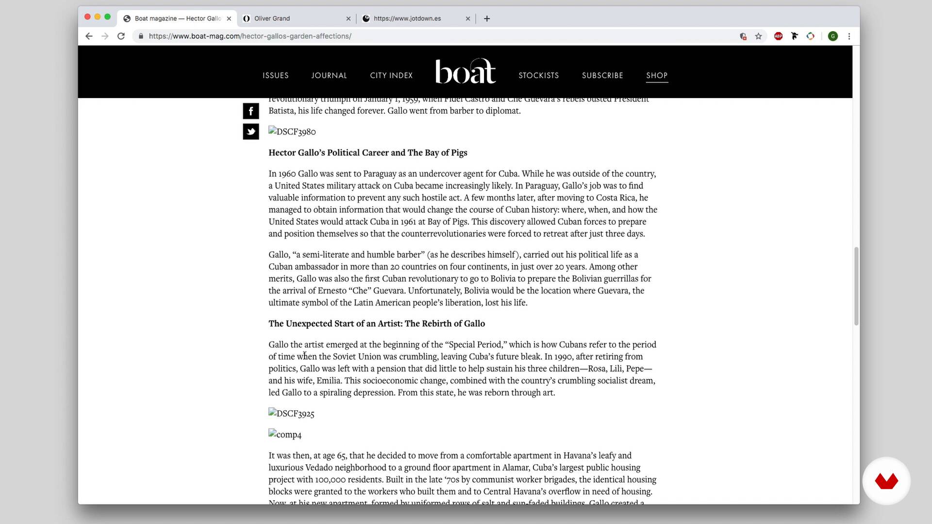
The importance of typography in digital formats
7 minutes, 52 seconds
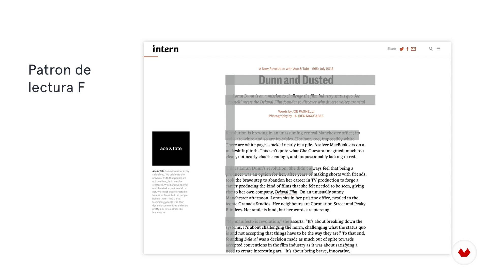
How do we read on screen
5 minutes, 4 seconds
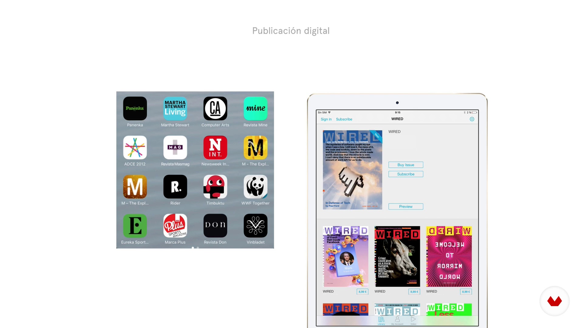
Devices, screens and formats
7 minutes, 29 seconds
Microtype and macrography
2 minutes, 34 seconds
What's included in this course?
Meet Gemma, who tells you a little about her passion for design, her professional career as a designer and teacher, and the most representative projects she has carried out for major brands. In addition, she shares her influences, which vary between books and websites, to serve as inspiration.
Learn a bit of history and the importance of typography in digital formats. Understand the differences between designing with paper and digital typography, considering devices, screens, and formats. See what micro and macro typography is and get to know the concepts of hinting, anti-aliasing, and orthotypography.
How do I choose a font? Where do I find an ideal one for screens? Gemma explains everything you need to get the perfect typeface for your project, she shows you the websites where you can download it and the features it must have for reading comfortably on the screen.
Choose fonts for different functions of the text: headlines, body text, and interactive elements, then delve into the composition. See everything about the recommended font size for digital reading and how you should adjust it according to the device on which the font is going to be rendered.
Create a grid to order the content on the page, define an appropriate column width, and learn about the ways to establish a hierarchy between the elements of the page considering a key element: white space.
Do a final check to test how the font looks in different browsers and operating systems, using some tools and tricks that Gemma shares with you.
Now have the necessary knowledge to choose the perfect font for a digital project and, in addition, you know exactly how to work it so that your texts are comfortable to read.
What is this course's project?
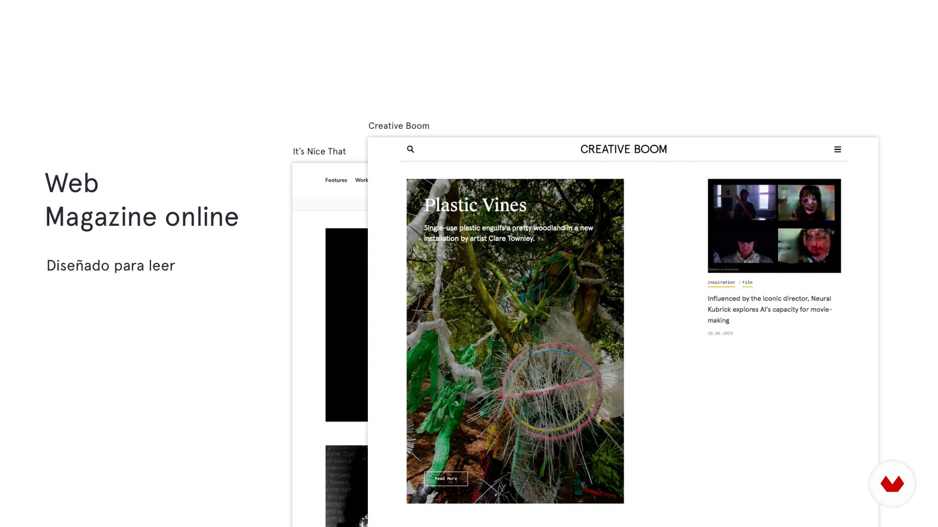
Design a digital magazine for the web step by step.
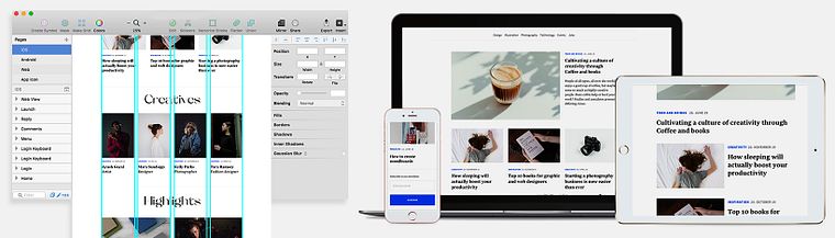
Projects by course students


Who is this online course for?
Anyone who needs guidance on how to work with typography successfully in digital environments.
Requirements and materials
No previous knowledge is needed. Regarding the materials, you need a computer with a design program such as Adobe Photoshop, InDesign, or Illustrator. If you have Sketch, Figma, or Adobe XD, even better.
Reviews
- 5 months ago
Es un curso muy práctico que me llenó de herramientas para mi vida profesional.
- 9 months ago
Muy bueno.
- 11 months ago
For someone with basic knowledge on typography, I really feel like the course helped me level up. I applied everything I learned here in my existing materials, and the improvement can be seen by everyone
- 11 months ago
Me gusto el curso porque es muy practico y ella explica muy bien.
- 1 year ago
Me ha parecido apropiado la manera de explicar el proceso de usabilidad de la tipografia en pantalla y como escoger las tipografias para el diseño de materiales como los educativos

She currently combines her work with teaching at the BAU, Barcelona University Design Center, Spain, as art director of the final projects in the Postgraduate Program in Digital Editions, and professor in the Master's in Infographics and Data Visualization, which she also directs and coordinates.
Content
- U1
Introduction
- Presentation
- Influences
- Final project
- U2
Considerations
- A little history
- The importance of typography in digital formats
- How do we read on screen
- Devices, screens and formats
- Microtype and macrography
- Hinting and anti-aliasing
- Orthotography
- U3
Typographic choice
- Previous thoughts
- Where to find screen fonts?
- Characteristics of some typefaces to avoid
- Typography for body text and headlines
- Interactive elements
- U4
Composition
- Typography Size
- Line spacing and vertical rhythm
- Reticle
- Text column
- Hierarchy
- Blank space
- U5
Details and final checks
- Test the typography
- Final check
- FP
Final project
- Typography Concepts for the Screen
What to expect from a Domestika course
Learn at your own pace
Enjoy learning from home without a set schedule and with an easy-to-follow method. You set your own pace.
Learn from the best professionals
Learn valuable methods and techniques explained by top experts in the creative sector.
Meet expert teachers
Each expert teaches what they do best, with clear guidelines, true passion, and professional insight in every lesson.
Certificates
PLUSIf you're a Plus member, get a custom certificate signed by your teacher for every course. Share it on your portfolio, social media, or wherever you like.
Get front-row seats
Videos of the highest quality, so you don't miss a single detail. With unlimited access, you can watch them as many times as you need to perfect your technique.
Share knowledge and ideas
Ask questions, request feedback, or offer solutions. Share your learning experience with other students in the community who are as passionate about creativity as you are.
Connect with a global creative community
The community is home to millions of people from around the world who are curious and passionate about exploring and expressing their creativity.
Watch professionally produced courses
Domestika curates its teacher roster and produces every course in-house to ensure a high-quality online learning experience.
FAQs
You’ll learn how to select, combine, and apply fonts for digital projects, enhancing readability and usability across websites, online magazines, e-books, and apps, using professional layout techniques, CSS, and current digital tools.
This course is aimed at those with basic graphic or digital design knowledge and is intermediate level. Prior experience with design and digital tools is recommended.
You’ll need some background in graphic design and basic digital editing software. Access to tools like Sketch, layout software, and basic CSS and HTML knowledge is also recommended.
The course teaches you to compare font families, analyze readability and technical compatibility, and tailor your choices based on audience, format, and digital context for the best reading experience.
Yes, it covers techniques and criteria for readability, including line spacing, size, contrast, visual hierarchy, and composition to enhance reading across devices.
You’ll learn to spot and apply key differences like size, hinting, contrast, and composition, adapting typography to the technical specifics of digital devices.
Yes, the course shows how to implement web fonts with CSS, use Google Fonts, enable ligatures, and fine-tune typographic settings for professional digital results.